Elevating Web Design Through Typography
Typography is an essential aspect of effective web design and has a significant impact on conveying information, enhancing user experiences, and eliciting emotions. Matej Latin’s book, “Better Web Typography for a Better Web,” is a valuable resource for both web designers and web developers who aim to utilize typography to create visually appealing and user-friendly websites.
This book, Latin’s, is not just another addition to the realm of typography resources; it is a highly acclaimed work that has established its status as a must-read in the field. Derived from a top-rated online course, this thorough guide sets out to dispel the mysteries of typography, making it available even to those without prior experience in the realm of design. It addresses a significant void in the world of web design, presenting practical, condensed, and comprehensive guidance that caters to the needs of both designers and developers.
The strength of “Better Web Typography for a Better Web” lies in its straightforward and clear approach to typography, effectively breaking down complex concepts such as vertical rhythm, modular scale, and page composition into accessible explanations. This makes the book suitable for both beginners and experienced designers and developers.

Practical Approach: Unleash the Power of Hands-On Learning
This book stands out with its practical approach. It moves beyond theoretical knowledge and encourages readers to actively apply what they learn. The book is cleverly organized to include live code examples, enabling readers to create a sample website and gain hands-on experience. This immersive approach not only enhances understanding but also makes it a highly efficient learning tool. The book encompasses a diverse array of essential topics regarding web typography, ranging from the basics to advanced concepts. It serves as a all-inclusive guide for anyone seeking to improve their typographic abilities.
Introduction to Web Typography
A comprehensive guide that will help you get started. This resource provides a solid foundation by introducing you to the fundamentals of web typography.
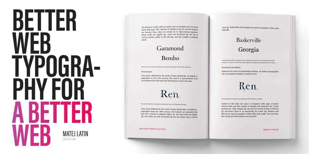
- Anatomy of a Typeface: Understanding the building blocks of typefaces. This section delves into the different components that make up a typeface and how they contribute to effective design.
- Choosing Typefaces: How to select the best typefaces for your projects. This section provides guidance on selecting appropriate typefaces for various contexts and designs.
- Equilateral Triangle of a Perfect Paragraph: Mastering the art of paragraph composition. Here, you will learn about the balance between font size, line height, and line length, and how to optimize readability.
- Combining Typefaces: Crafting harmonious typographic combinations. This section provides practical tips and guidelines for creating complementary typeface combinations.
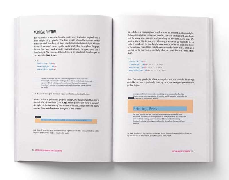
- Rhythm in Web Typography: Establishing a consistent visual rhythm on your web pages. This section explores the importance of establishing a consistent vertical rhythm to enhance the overall reading experience.
- Modular Scale: Utilizing mathematical principles for balanced typography. This chapter introduces the concept of modular scale and its critical role in creating harmonious typography across various screen sizes.
- Page Composition: Designing layouts that enhance readability and aesthetics. This chapter provides insights into layout design, grid systems, and the effective use of whitespace.
- Responsive Web Typography: Adapting typography for different screen sizes and devices. This chapter addresses the challenges and techniques involved in adapting typography to different devices and screen sizes.
- Ligatures: Discusses the use of ligatures, i.e., the joining of specific letter combinations for a more aesthetically pleasing result.
- Small Caps and Figures: Explores the use of small caps and figures to add variety and readability to typographic designs.
- Punctuation: Proper usage of punctuation marks for clarity and readability. This chapter delves into the finer details of punctuations and how they contribute to the overall typographic composition.
- Dropcaps (Bonus Chapter): Adding flair and elegance to your designs. This is an additional chapter that offers guidance on implementing dropcaps effectively.
Key Features:
- Clear and concise explanations of complex typography concepts.
- Numerous examples and exercises to aid understanding.
- Focus on the practical application of typography.
- Solid foundation in the theoretical underpinnings of typography.
- Suitable for both designers and developers.
- Highly recommended for anyone who wants to improve their web typography skills.
Review
“Beautiful typography should never be underestimated, it tells a story, it evokes excitement and seems so simple to create. It isn’t, but it will be once you have studied this must-read edition.” – Steve Jenkins, Editor, Web Designer Magazine.
“Matej addresses designers and developers equally—but not only has he written an informative book with useful content, it’s also written in a nice and lovely-to-read way.” – Marc Thiele, Founder / Organiser of Beyond Tellerrand.
“Seriously detailed and, more importantly, fodder for any discussion with clients to convince them why the fonts you chose were the right ones for the project.” – Paul Jarvis, Designer & Author of Company of One
“A must-read for any web designer/developer. As a designer who also works in front-end code, I’ve been waiting for a book like this, which addresses both designers and developers. Often, there is still a huge gap in the collaboration between design and code. This book will help to improve this process and make a web with better typography.” – Arne Schog, Digital Designer.
About The Author
The author, Matej Latin, presents his distinct journey and proficiency in the forefront. Born in Slovenia and currently residing in Edinburgh, Scotland, Latin is a Senior UX Designer at GitLab. His love for design and typography grew at a young age when he delved into web design and HTML. He honed his skills in typography through self-teaching, and his passion for the convergence of design and development is apparent in his work.
In response to the scarcity of online resources that are practical, concise, and comprehensive for both designers and developers, Matej Latin undertook the mission to create “Better Web Typography for a Better Web.” This book serves as a symbol of his commitment to bridging this gap and providing a valuable resource for anyone who aims to improve the visual appeal and user-friendliness of the web.
An Essential Resource: Enhancing Your Typographic Skills
“Better Web Typography for a Better Web” is a highly regarded resource for web design. It is an indispensable guide for web professionals seeking to enhance their typographic skills. Matej Latin’s ability to simplify complex concepts, combined with practical examples and a hands-on approach, distinguishes this book. Whether you are a designer or developer, this book is poised to be a turning point in your pursuit of creating more visually appealing and functional web designs. By blending theory and practice, Matej Latin delivers on the promise of “Better Web Typography for a Better Web,” making the web a more typographically beautiful place for all.
Better Web Typography for a Better Web by Matej Latin. Hardcover: 226 pages. Publisher: Blurb (August 18, 2019).
Thank you for taking the time to read this article that we’ve carefully put together for our readers. We want you to be aware that there are affiliate links in this article. This means that if you buy something through these links, we may earn a commission. We appreciate your support as it helps us keep producing high-quality content. Rest assured that our recommendations are always honest and unbiased.